Autonomy, but will you weigh in?

annafl

Esteemed Member
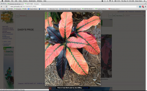
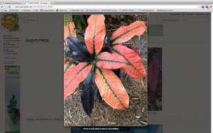
Dean has given us autonomy to decide how to view the wiki photos. Right now, most of the photos are set to be viewed single file, in a larger size that fills most of the page, and with great high-density resolution i.e. Buddy. If you look at Carribean Star, this is the other choice. The photos are viewed two or three side-by side in each row, but are smaller photos. On my old ipad I can see mostly single file of these smaller pics anyway, with some smaller photos being side-by side.

Personally, I much prefer the larger size. I immediately see a detailed picture without having to take the time to enlargen it. However, if the majority prefer the side by side, I will change it to that.

Please, above all, give your opinion. There are thousands of photos, so needless to say, I only want to do things once. Don't take into account the amount of work it is for me. I still have to go through and make a small syntax change to all the cultivar entries anyway, and I am going through and checking for typos/ misspellings, etc. also, so speak your unbiased mind. Thank-you!:)
 
Thanks for your opinions, you two. Just in case anyone didn't know (I didn't know until Dean told me), you can enlarge both sizes. You click on the photo, once you see the darker shadow around it, you click on the 'more info' below it, then click two times on that photo. That takes you to full screen size on either one.
 
Keep up the good work, you have improved the wiki so very much already.
image.jpg
 
I regretfully disagree…personally, I like the smaller rectangular (panoramic or portrait) size the way it was before the format was changed to thumbnail (very small square) or large (full page).

I like the old rectangular format that Marie Nock utilized in her recent post to Ana’s Wiki Photos 2014 of Crotons Imelda (Lemon Top) and Davis 17 on SAT10MAR2014. This way I can pick and choose the Cultivar that I want to see enlarged and not wade through all the giant sizes if it’s a multiple photo submission also, descriptive narratives, opinions or doubts anyone has (important part of any photo) stand out much better.

Note: That’s my opinion just on the photo size…what has been done with the with the rest of the Forum Layout is great. My sincere congratulations to all the “MOVERS AND DOERS” that have brought these changes about…KUDOS ! :)
 
Last edited:
I have no problem either way,but sometimes the larger pictures do look a little too big but other times they look just fine??
 
I would like to contribute with my reasoning and preferences, and what we are doing with the PalmPedia. And note that we are discussing the photos in the wiki now - not the forum.

The trend in viewing is toward smaller screens, tablets, and smart phones - this represents about a quarter of the viewers today and growing. These full sized photos represent somewhat of a problem for these devices, and for people downloading information and photos on slower connections. Even though the photo may appear smaller on a phone, the same large amount of information needs to be downloaded. For people in other countries, many pay extra for downloading more data.

When viewing a topic with many large photos, it may take a much longer time waiting for all of them to load, and then scrolling through a long page to see them all. And if you are using the resource for identification purposes in the field - this is annoying to say the least. For example, if I want to pull out my smart phone and check on the ID of a palm I may be questioning in a botanical garden, I would like to go to a page and have it load quickly, and then expand a photo or two that may show the crownshaft or flower, or a close up of the leaf that would aid in my ID. Having to scroll through a large amount of photos is cumbersome to say the least. Or if I would just like to read the topics or descriptions, having to scroll through long pages on a smaller screen is laborious.

If I wish to view the nice full size pics I click on the photo and the new viewer pops up that sizes the photo perfectly for whatever device you are on. Then I canc click on the left or right of that photo and view all the photos full size if I desire - much easier than scrolling.

It needs to be recognized that everyone's viewing experience is different. And the best solution is the one that accommodates the majority the best. And in a few years the majority will no longer be sitting at their desks viewing these photos, but on a laptop, tablet, or phone - many times away from home.
 
Dean, I guess I don't fully understand. I had no problem today viewing the large or small photos on my very old iphone. This was in the grocery store parking lot. I have not tried my very old ipad away from home, but at home, it works just as well with small or with large photos. In the future, these devices will be even better and faster. And my devices are very old by today's standards.

Our encyclopedia is very different than the palm one. We are lucky to have five or six photos in one cultivar and there is very little text. Yes, I think one or two have 8-10 photos, but most have 2-4. Even the one with 10, I had no trouble looking at from the grocery store parking lot on my old iphone. With crotons, small details on leaves and petioles is frequently much more important than with palms, and is sometimes crucial. With the large photos it does involve more scrolling, but I'd rather do this than continuously click to see detail.

It takes 4 clicks for me to view the Caribbean Star at full size. It's the same for Buddy, but the first larger photo is available without any clicking and it's almost as detailed as the full-sized photo that takes 4 clicks. I find it almost unneccessary to click any further.

Maybe other countries do have longer wait times than us, or have to pay a fee. However, I think there are probably few that have this problem and they are quickly catching up to us. How many viewers from these other countries do we have? Take into account crotons are only grown outside around our latitudes and warmer. I would venture to say most croton forum viewers are Floridians or Californians. Not necessarily the same at the palm forum, I'm sure.

I'm sticking with my preference for large photos. If you'd like to change your vote, please let me know. Also, please weigh in about your particular experience viewing the wiki on your iphones and ipads. Thanks!
 
It doesn't make much difference to me either way. The large pics take a little longer to load on my computer. On my phone the pictures load at their maximum size anyway. When I click to enlarge in caribbean star the picture remains the same size just in another frame. In buddy nothing changes. I think I would have to defer to Dean's judgement. I find it easy enough to click on a photo and have it enlarge.
 
Let's do this.

Ana - find me the five Croton pages with the most photos - preferable 6+ - if there are any. Then I will make each one five different sizes. This way we will have a real demonstration of the options we are considering, and people can "vote" for a real option.
 
Ok Dean, I think these are the ones with the most: Buddy, Stoplight, Sturrock's Pink Veitchii, Sybil Griffin, and President Reagan. But remember, these are the most from 601 cultivars. Most out of the 601 only have 2-4.

Thanks for all the votes, everyone. Please let's keep giving our opinions so we can have what the majority want.

Chris, I didn't know how to do it either. The way to get a full-sized photo is to click on the photo, when you see the dark shadow around it, there will be something at the bottom that says 'more info'. Click on that and it takes the photo away from the dark shadow. Then click on that two more times and it will enlarge fully.

Mike, I think I know what you're experiencing because I do too. I think if the photos aren't in very good focus, it really shows up when you enlarge it fully and it doesn't look good. That's why I try to only use photos in perfect focus, but sometimes the photos are needed in a cultivar. It adds something different, etc. Over time, when we get more examples, I will cull those photos for the ones in perfect focus.
 
Last edited:
If there is a technical reason to go smaller do so, if not go big it baby.
The technical reasons are a matter of options. Starting large, there is no way to compress, load, and view smaller photos quickly. With larger photos there is no way to load fast and view quickly on all devices. And there is no option to select which photos you want to view large. It is one size fits all - and that size is large.

By starting smaller you can always choose which ones are worthwhile for you to view larger with one click. And with one click you can always then scroll through and view them all individually full screen if desired.

I would be curious to know - so if you read this and express an opinion - please state what kind of device your vote is based on - desktop, laptop, tablet, or smart phone. Personally I view on my laptop at home, and smart phone when elsewhere.

This is what viewing Buddy at 500px looks like on my laptop if I don't have a full sized window open, and I am not signed in. This is what a guest would see. The photo is way too big to see it all, and they would have no idea how many other photos are even available for viewing.

Personally I like to see all photos easily and in enough detail to decide which ones I want to see full size.

Buddy.png
 
Last edited:
Dean, I have zero tech. Ability and use only my IPad for everything. It sounds like 350 as you suggested might be best and we can do what ever from that. The changes you have made seem to be working out very well, clear sharpe and very fast. Thanks for all your work.
 
Dean, I have zero tech. Ability and use only my IPad for everything. It sounds like 350 as you suggested might be best and we can do what ever from that. The changes you have made seem to be working out very well, clear sharpe and very fast. Thanks for all your work.
You're welcome and thanks for the info - feedback is always very useful.
 
My vote is still for 500px. My second choice would be 400px. When viewing crotons, it is important to see detail and it takes 4 clicks to get a large photo otherwise. When enlarging several pics, it seems to be a waste of time to have to do it for 4-6 photos when you can have a photo that's large enough not to even have to get more detail in most cases. For me, that's the 500px size, and then, the 400px size can fill the bill sometimes, depending on the photo and how close up it was taken. Smaller than that, I'm still having to click, click, click, click to see the detail I want on every photo. I base this on viewing on my PC, ipad and iphone. I have no problems with the time it takes to load, even on my iphone and ipad which are ancient by many people's standards.

That being said, I would be happy with whatever size the majority wants. We have a beautiful site to go to, thanks to all the folks who have taken the time to post these gorgeous plants! Come on now, photos, people, photos!
 
Firstly, I work from a desktop and my wife is the computer tech person in our family.

Second…personally the 300px option seems to be the best choice for me. By starting with this size I can quickly scroll down and easily see what is available in the cultivar that I’m interested in. This size allows me to check the quality of the pic or any other detail that tickles my fancy and click only once on any photo if I choose or see them all (large) on the arrows provided on full screen as you said.

Third…no one is asking yet and I realize the subject is WIKI PHOTOS but will the FORUM PHOTO FORMAT be discussed with the same zeal as the WIKI PIX? If so, my vote would go for the 250px size as displayed in the second row for the same reasons I stated above in my second point…just my opinion. :rolleyes:

NOTE: I’ve said it before and I’ll say it again…Ana, thanks for “rattling the cage(s)” on this subject. Dean, many thanks also to you for your patience and technical support in order to make our CROTON site the best there is and a pleasure to use. :)
 
Let's see here.....
First, Ana - I am a little confused - as "donroberth" indicates, I am only one click away from any thumbnail for a full sized photo that fills my screen (or whatever screen/monitor I am using. Is this not the case for you? When I click on a photo once, this is what I get. This is my full screen.
Ana1.png
And if I choose to hide the toolbar when browsing, the photo fills even more of my screen - like this.
Ana2.png
(Ana - please take a screen shot of what you see when you click on a photo once, like I have. Hold down your shift key, the command key, and the number 3 - all at the same time for a screen shot)

And "Don," the forum is a different case. What we use on the forum has to apply to all photos, and the needs for Crotons are different than the needs for palms, or other trees. On the wiki we can use different settings for different areas. And for the palms on the wiki we use different sizes since we have so many photos. To display 50-100 photos at 500px would make a page very very long, and slow to load.

Presently there are three ways to post a photo in the Forum - attached, thumbnails, or full size. So I have choosen to leave it up to the poster to decide. But I prefer the thumbnail, as I have done above, and would prefer everyone use it - as it looks cleaner, I can add more where I desire in a smaller space. And as discussed already, it is one click away from a photo to fill the screen.

And I too have to add my thanks to Ana for all her time and hard work. Between what Bren did, and what Ana is doing, we are creating quite a valuable resource.
 
Last edited:
Thanks Ana - two suggestions - if you got rid of the tool bar at the bottom (with all the icons), like you can see I did - then that photo would render much larger automatically. You can make it "auto-hid" so that space is not wasted when viewing photos. And it you also got rid of the very top tool bar as well (when browsing), as you can see I did in my second screen shot - then the photos that would render with the viewer would fill almost your entire screen. And then you could "flip" through all of them in that full size.

Notice how this photo fills almost my entire screen when using the viewer and one click. I could even hid the bookmark bar when browsing, if I desired, and the photo would fill even more of my screen - like in the second screen shot.
Ana2.png


Ana4.png
 
Last edited:
Dean, my husband and I share the PC. When I go to the wiki it's usually to check out one or two cultivars that someone is posting about. It is too much trouble to figure out how to remove the icons and the tool bar just to view a couple of photos, then change them back. That's what I'm trying to avoid- having to click on too many things to view one photo, that's why I prefer a large photo that shows detail right away without having to click four times on each. I doubt too many people here would remove their icons and tool bars to occassionally view a few photos on the wiki.
 
Ana, there is a convenient setting that always hides the bottom Dock when not in use. It is the preferred method for setting up your desktop - permanently. There is no reason to always have it sitting there using up valuable space. The auto-hid is a great feature, and a great advantage to have it disappear when you don't need it. Then when you move the mouse to the bottom of the screen, it pops up and you choose your program, and then it disappears again. I thought everyone did it that way.

I can't imagine having that thing in my way all the time. Or at least move it off to the right or left. Click on the Apple (top left) and go to "Dock" - then "Dock Preferences" - and make your Dock more user friendly. Below is how I have mine set up. It looks as if you are still using the out of the box clunky default setting.

Tool Bar.png
 
Alright, Dean. I set the icon bar the way you showed me. It makes no difference in the size of the photo that I view at one click. The photo is still smaller than the first view as is. And, it seems you've set the auto size back to 250 or 300 px? The two pics I uploaded today look tiny. So much for autonomy!Yuck

Here is the photo of my screen so you can see for yourself.
Screen shot 2014-05-20 at 11.38.47 AM.png
 
Alright, Dean. I set the icon bar the way you showed me. It makes no difference in the size of the photo that I view at one click. The photo is still smaller than the first view as is. And, it seems you've set the auto size back to 250 or 300 px? The two pics I uploaded today look tiny. So much for autonomy!Yuck

Here is the photo of my screen so you can see for yourself.
Thanks for the screen shot Ana - it is always educational to see other's screens. Because, as I have said, what you are seeing is not what I am, or what others may be. I have only been trying to illustrate the importance of considering what other viewers experience.

As you have seen, one small change on your desktop and the photo became larger. By using a higher screen resolution the viewer photos would become even larger. But all these options for optimizing your screen and maximizing photo size are for each person to set up on their desktop. Another suggestion I may offer is to consider setting up a separate user account for you, and one for your husband - that way you can set up and save all your preferences while maximizing your photo viewing and web surfing experience, and he can maintain things as he prefers. Most people that share computers do this so they can personalize their own way of viewing, organizing, and "doing things."

But the autonomy and decision on photo size remains yours and those of the CrotonHeads. The auto size hasn't changed and is still set to 300px - as this is what we need for Palmpedia. You have been overriding that by using the height and width="500px" and can continue to do so. But keep the 'perrow' setting at auto by either eliminating it or keeping it blank with perrow="" That way it will automatically place as many side by side as a viewer's screen permits. This will be 1 for some, 2 for others, even 3 for those with higher resolution screens - and for mobile, that remains to be seen.

So please continue with whatever size you and the others decide on - and let me know if you have any questions.
 
Last edited:
Actually Dean, the shot did not become larger, it did not change size at all despite the icon bar being gone. It still takes 4 clicks to get a larger photo.

But on another note, despite the syntax on the cultivars showing widths="500px" heights="500px", the photos I've entered in the wiki recently are all 300px. For example, look at today's entries. David King's nice photos of Pride of Naples and Yellow Iceton. The syntax shows the 500px, there are other photos in both these same cultivars by Jerry Shilling and Scott McIntosh that are 500px, and today's photos are 300px. Check it out. Why is that? I'm not doing anything different.
 
Ana - Let me answer each of these separately. Here is a side by side of your first screen shot with the Dock at the bottom on the left, and with the Dock gone on the right. Notice that the photo has automatically gotten larger and filled the space the Dock occupied before. It you used a different resolution, and made all the tool bars at the top smaller, the photo would also "grow" and occupy that space as well. Please see my example further up in this topic. You can see how much more screen "real estate" I have available.
Comparison.png
 
And for your second issue. Everything appears normal on my computer - that is the pics are at least 500px and filling my entire screen. See below. This all becomes somewhat complicated to explain, and one of the reasons I suggested you set up your own account - so settings, cache, etc. are not effected/changed by another user. Remember the "trick" I showed you with Command/+ or - Perhaps that has been changed again. Or you looked at the page once, before you changed the parameters to 500px - in which case that page is cached with the 300px photos. Or it could be some other things. This is why I keep stressing the differences in the way something can be viewed. Different settings, different browsers, etc - even on the same computer - will confuse things if you don't understand the concepts of resolutions, caching, and browser font settings (larger/smaller). To view things "unadulterated" you need to have the font setting at neutral - Command/"zero" and clear your cache. Command/r on Chrome I believe (maybe shift-command/r)

Please try a different browser after assuring your cache has been cleared and tell me if you don't see this page as I do. As you can see, the pics are so large for me I can not view them all without scrolling.

Yellow.png
 
Last edited:
Clearing cache is a scary thing. I just googled how to do it on chrome, and removed cache from images and files in the last week. Don't think that was a cool thing to do now. I had to re-program my password to keep me logged in when I tried to get back. Heaven knows what else I cleared! Only time will tell, but I fear I may be in big trouble.

Anyway, not sure whether that's the cache I should have cleared, but I have not changed the command + or - since we last mentioned it. Photo size has only changed recently- in the last week. I checked Firefox and I see the same thing as with Chrome. You can't see all of the photos, but you get the idea about the discrepancy in size. This is what's been happening when I put new wiki photos in as opposed to over a week ago:

Screen shot 2014-05-20 at 7.50.23 PM.png
 
Ana - we may have to talk again. What you are describing and showing are two different "formats" of photos. One is a 'landscape' (meaning longer than high) and the other is a 'portrait' meaning higher than long. Two portraits will fit side by side on your screen, but two landscapes, or a landscape and a portrait will not. If you check, you will notice that both of the photos you have posted above are 500px in height. And that is the priority when using the auto-arrange in order to enable them to be arranged in a row - otherwise they will be different heights.

I hope you understand. There is no way to place photos of differing heights in rows - as the Gallery does. And when you make a portrait the same height as a landscape, it has to be very much smaller width-wise. Hard to explain, but a difficulty when trying to mix portraits and landscapes together, and keep them neatly in a row. Do you want to talk again on the phone?

If you want these large photos, and want to mix landscape and portrait side by side and keep them large, then you will have to do them outside of the Gallery feature and post them using another method - which I will be happy to show you. In that method you can assign a separate size by photo - but again, you can't put a landscape side by side with a portrait and have them the same size, only a compromise between the two. Because if the heights are the same, the widths are different, and visa versa.
 
Top